AI can generate beautiful web pages. But when you're managing a company website, beauty alone isn't enough — you need consistency. Every page needs to look like it belongs to the same brand. Capuzzella solves this with a built-in design system that gives the AI a blueprint for your corporate design.
The Problem: AI Without Guardrails
Ask an AI to "create a pricing page" and it will produce something that looks good in isolation. Ask it again to "create a team page" and you'll get a different layout, different button styles, different spacing, different colors. Each page works on its own, but side by side they look like they belong to different websites.
For a personal blog this might be fine. For an enterprise website with dozens of pages maintained by multiple editors, it's a problem. Corporate design exists for a reason: customers expect a consistent visual experience across every page they visit. Inconsistency erodes trust.
The Solution: Components as AI Context
Capuzzella's design system is built on a simple idea: give the AI a library of pre-approved HTML components, and let it use those as building blocks when creating or editing pages. Instead of inventing markup from scratch, the AI references your existing component templates and produces output that matches your established design.
The system has three parts:
- A components directory where your design team stores HTML templates
- A /design-system page where the team browses, previews, and (for admins and designers) edits components in the browser
- An @ mention system in the Editor Panel that lets editors attach specific components to their AI requests
The Components Directory
At the root of every Capuzzella project is a components/ directory.
Each file is a self-contained HTML template named after the component it represents:
components/
  button.html
  card.html
  navbar.html
  modal.html
  dropdown.html
  collapse.html
  carousel.html
  breadcrumb.html
  list-group.html
  nav-tabs.html
Each file contains variant labels and example markup. The design-system page derives the component title
from the filename, so the file itself does not need a wrapper <section> or
<h2> heading. Here's a simplified example of what
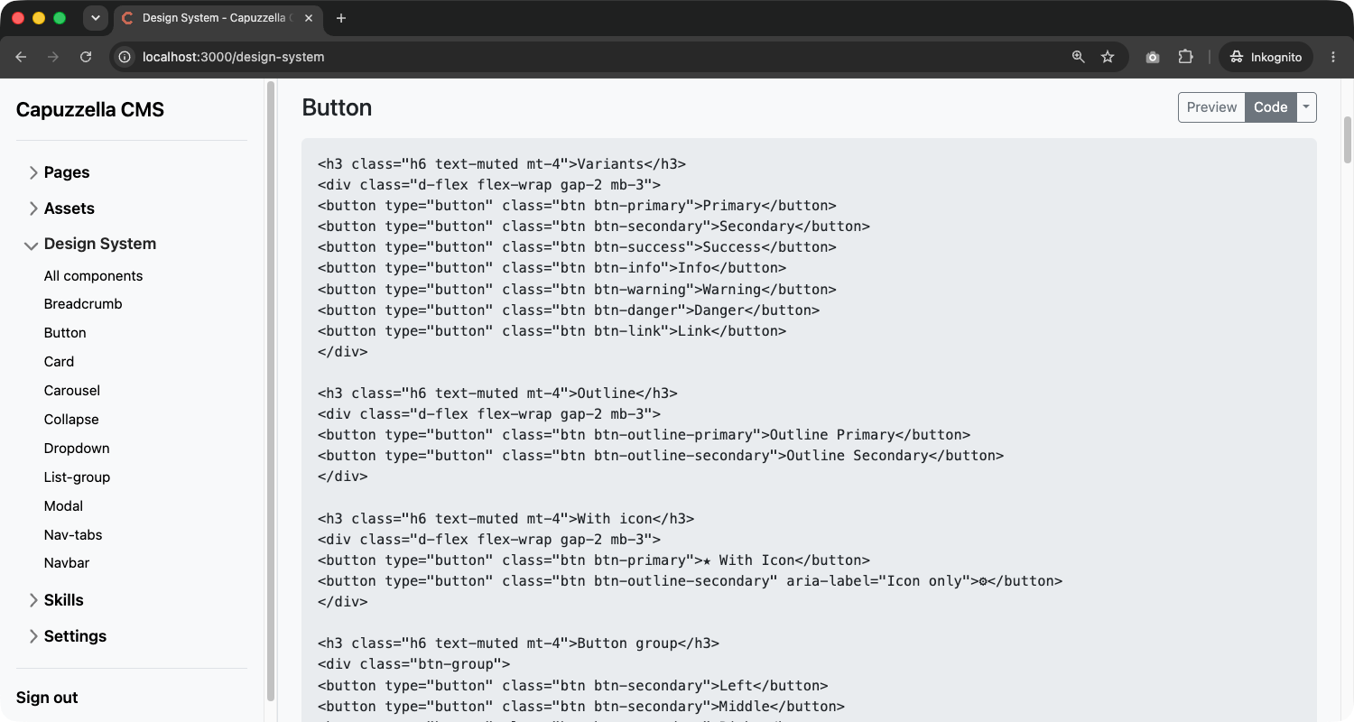
button.html looks like:
<h3 class="h6 text-muted mt-4">Variants</h3>
<div class="d-flex flex-wrap gap-2 mb-3">
<button type="button" class="btn btn-primary">Primary</button>
<button type="button" class="btn btn-secondary">Secondary</button>
<button type="button" class="btn btn-success">Success</button>
</div>
<h3 class="h6 text-muted mt-4">Outline</h3>
<div class="d-flex flex-wrap gap-2 mb-3">
<button type="button" class="btn btn-outline-primary">Outline Primary</button>
</div>
<h3 class="h6 text-muted mt-4">With icon</h3>
<div class="d-flex flex-wrap gap-2 mb-3">
<button type="button" class="btn btn-primary">★ With Icon</button>
</div>The format is intentionally simple: plain HTML with your project's CSS classes applied. No JavaScript framework, no build step, no proprietary syntax. Designers can author components in any text editor, and the AI can read them without needing to parse anything beyond standard HTML.
The /design-system Page
Capuzzella renders every component on a dedicated /design-system page.
Navigate to https://your-website.com/design-system (login required) and
the system reads each .html file from the components/ directory.
The sidebar lists All components plus a link for each component. Click a
component name to open its own page at /design-system/<name>/.
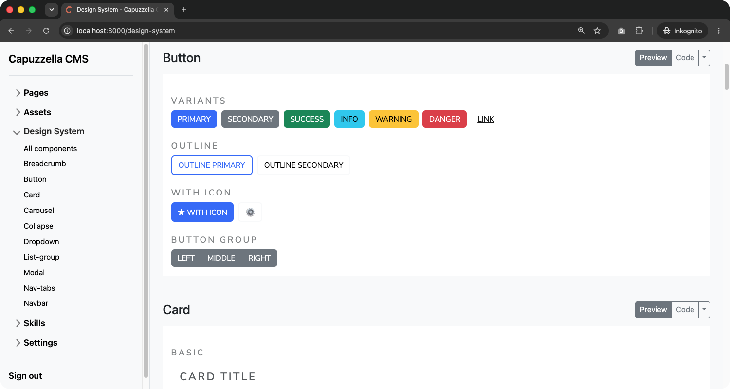
Every component block shows the title (from the filename), a Preview /
Code toggle, and the rendered output. Preview loads your project's Bootstrap
stylesheets and theme.css inside an iframe so the component looks exactly as it
will on the live site. Code shows the raw HTML stored in data/components/.
This page is a living reference for the whole team. Designers verify how components render. Editors see which building blocks exist. Because it reads directly from the components directory, changes appear as soon as the underlying file is updated.
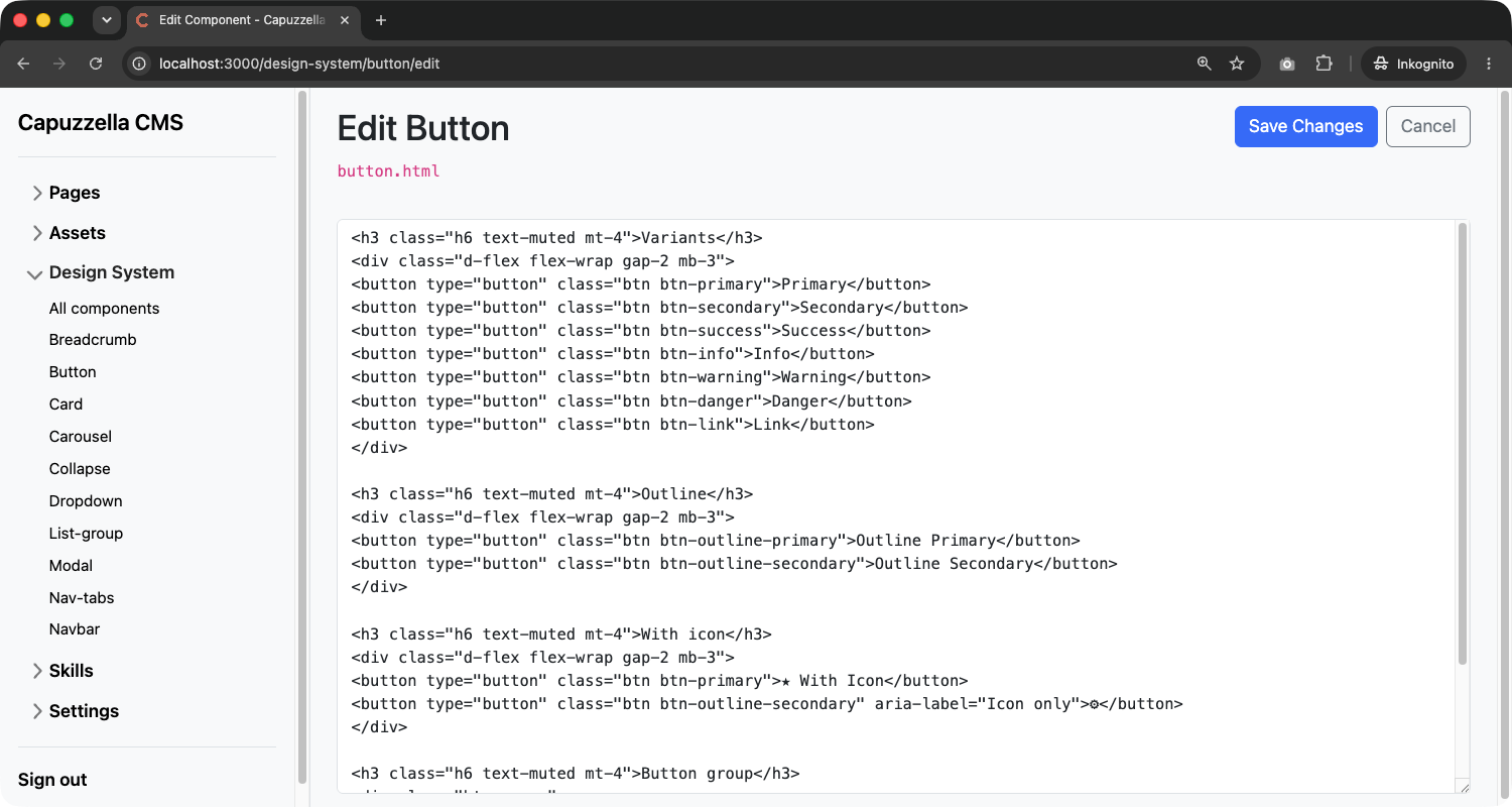
In-Browser Editing
Admins and designers can edit component HTML directly in the browser — no separate editor or deploy step. Open the split dropdown on the Code button and choose Edit. That opens a dedicated edit page with the full component source in a textarea.
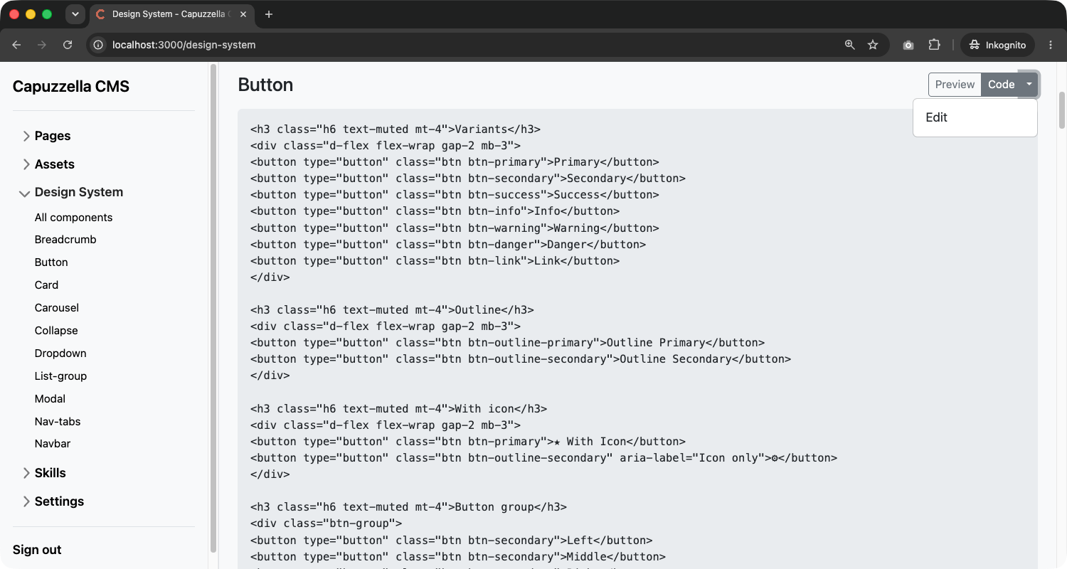
On a single-component page (/design-system/<name>/), the same dropdown also
offers Delete with a confirmation prompt. Editors and viewers can browse
components but cannot use the edit UI.
How the AI Uses Components
The design system isn't just a visual reference for humans — it's the AI's blueprint. When the AI creates or edits a page, it has access to your component library and uses those templates as the basis for its output.
This happens in two ways:
Automatic: The AI Loads What It Needs
The AI's system prompt includes a list of all available component names. When
the AI decides it needs to add a card section, a navigation bar, or a set of
buttons, it calls a get_components tool to load the relevant
templates before generating any markup. The loaded HTML is injected into the
conversation, giving the AI exact reference material for your design.
The system prompt instructs the AI explicitly:
"A component library is available with HTML templates designed for this project. When adding or editing components on a page, use get_components to load the relevant templates and base your HTML on them. This ensures visual consistency across the site."
Manual: Editors Use @ Mentions
Sometimes you know exactly which component the AI should use. The Editor Panel
supports an @ mention system: type @ in the chat
input to open a context menu listing all available components (and pages). Select
a component and its HTML is pre-loaded and attached to your message as context.
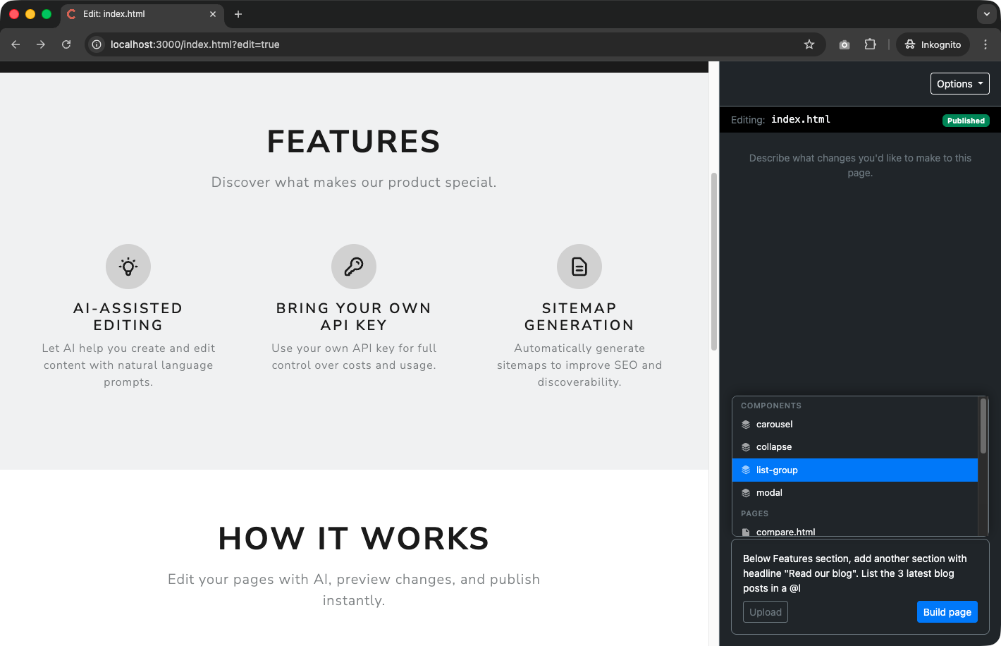
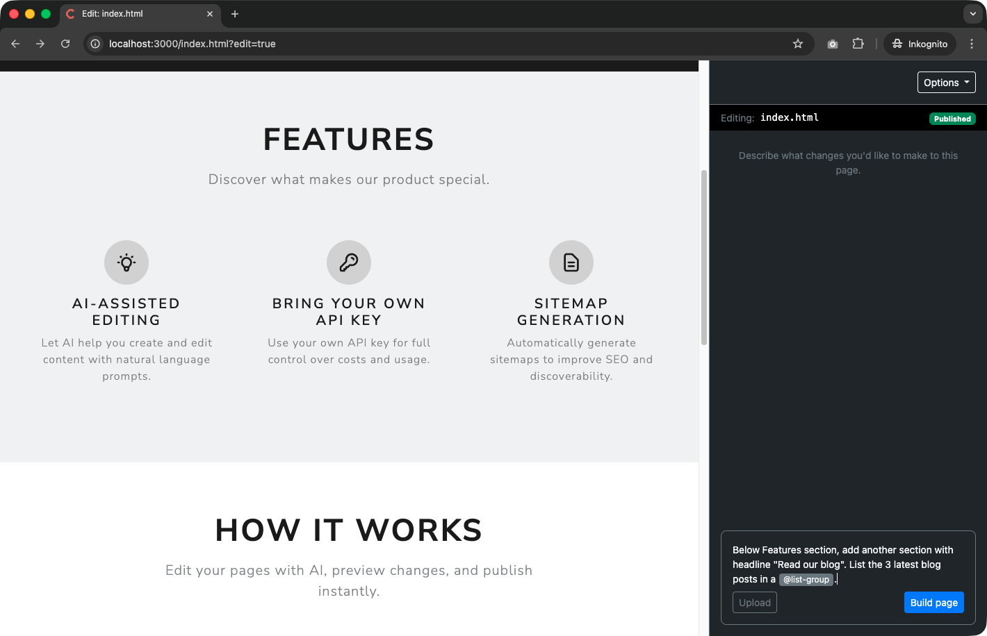
For example, if you want the AI to add a blog listing to your page, you can type:
Chat input:
"Below Features section, add another section with headline 'Read our blog'. List the 3 latest blog posts in a @list-group"
The @list-group mention tells the system to load the list-group.html
component template and attach it to the AI request. The AI then sees the exact
list-group markup your design team created and uses it as the basis for the new section.
No guessing, no improvising — the output matches your design system.
You can attach multiple components in a single message. Mention
@navbar and @button together if you need the AI to
reference both when building a page header, for example. The editor also supports
@ mentions for other pages on your site, which is useful when you
want the AI to match the style or layout of an existing page.
Why This Approach Works for Enterprises
Consistent Corporate Design at Scale
AI is powerful, but without constraints it produces inconsistent results. The design system gives the AI the right constraints: here are the approved button styles, here is how cards look, here is the navigation pattern. Every page the AI creates or edits aligns with the same visual language, because it's working from the same set of templates.
This matters most when multiple editors are working on the same site. Editor A can ask the AI to create a services page while Editor B works on a blog post, and both pages will share the same component patterns. The design system is the single source of truth.
Designers Stay in Control
The components directory is just a folder of HTML files. Designers don't need to learn a CMS-specific component format or a proprietary template language. They write HTML with whatever CSS framework the project uses, save the file, and it's immediately available to both the AI and every editor on the team.
Designers and admins can edit components in the browser on /design-system
without touching the filesystem directly. Need a new variant? Update the file in the
edit page. Need a new component type — say, a testimonial block or a pricing
table? Create a new .html file (via API/CLI or by duplicating an existing
one). It shows up on the design-system page, in the AI's component list, and in the
@ mention menu. No deploy, no build step, no cache to clear.
Low Friction Between Design and Content
In many CMS platforms, the design system lives in a separate tool — Figma, Storybook, a custom style guide. There's always a translation step between what the designer specifies and what the editor (or developer) implements. Components get interpreted differently, shortcuts get taken, and the gap between design and reality grows over time.
In Capuzzella, the design system is the implementation. The same HTML that designers create is the same HTML the AI uses is the same HTML that ends up on the published page. There's no translation layer, no interpretation, no drift.
The Workflow in Practice
Here's what a typical workflow looks like:
-
Designer creates or updates component templates in the browser
on /design-system or by editing files in the
components/directory. - Designer reviews the result on /design-system, using Preview and Code to verify markup and rendering with the project theme.
-
Editor opens a page in the Editor Panel and asks the AI to
make changes. The AI automatically loads relevant components from the design
system, or the editor uses
@mentions to specify exactly which components to use. - AI generates or modifies the page HTML using the component templates as blueprints, producing output that's consistent with the rest of the site.
- Editor reviews the changes, makes adjustments if needed, and publishes.
The designer controls the system. The editor uses the system. The AI follows the system. Everyone works from the same source of truth.
Getting Started
Every Capuzzella project ships with a set of default components (button, card,
navbar, modal, dropdown, and more). You can use them as-is, customize them to
match your brand, or replace them entirely. Each component is a .html
file in the components/ directory with variant labels and example markup.
To customize a component, open it on /design-system and use Edit (admin or designer), edit the file directly, or ask the AI to update it. To add a new one, create a new file. The design-system page, the AI, and @ mentions pick up changes immediately — no restart required.
If you're building a company website with Capuzzella, the design system is where you start. Define your components once, and let the AI handle the rest — consistently, every time.